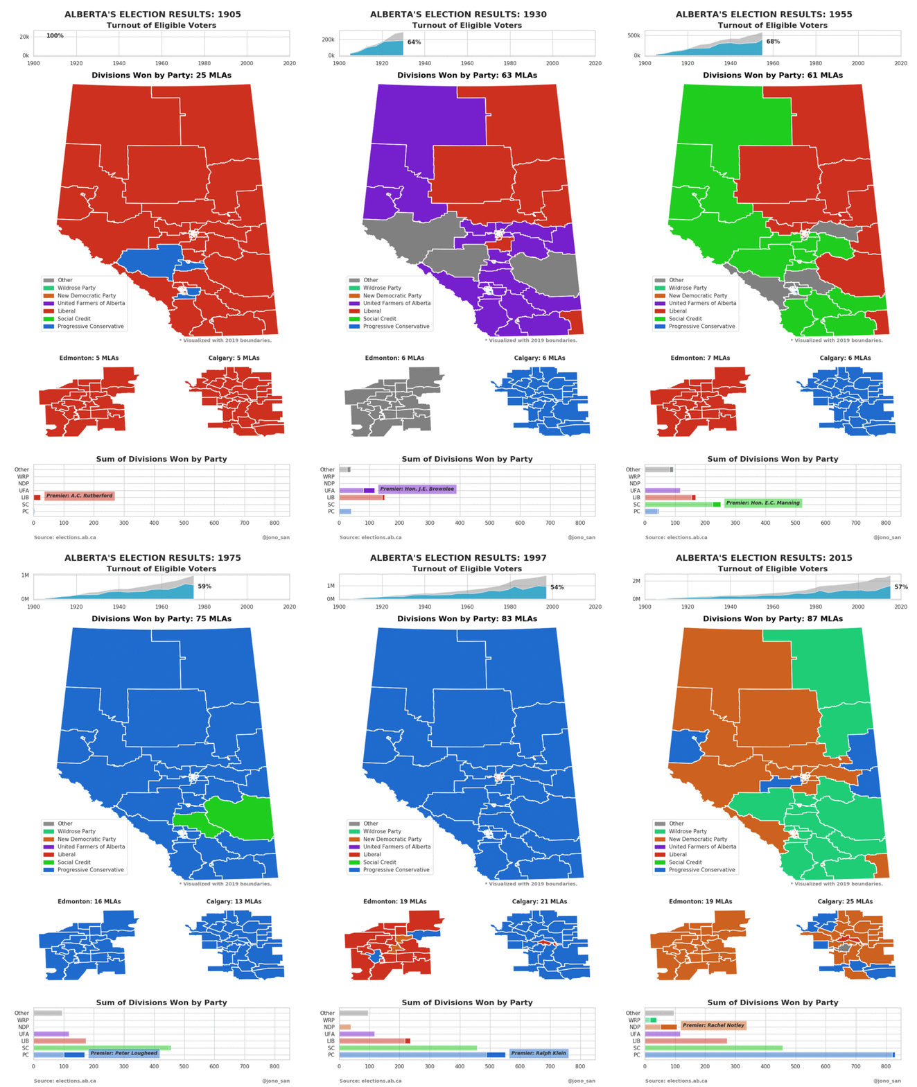
The province of Alberta entered Confederation in 1905 and has held provincial elections every 4 years since. To mark the 30th election on April 16, 2019, I set out to visualize this history, and see how each district has voted over time.
About the data
Along with administering the vote, Elections Alberta hosts much of the electoral data I used to make this visualization. The two types of data needed were the 2019 Boundary Maps and the election statistics.
The boundary maps contain GIS (Geographic Information Systems) data in the form of Shapefiles. These files establish the shape and position of the 87 electoral districts, in a vector-based format, allowing them to be rendered in Python.
The election statistics contain the results of each district for each election in a spreadsheet. These results contain details for each district such as the number of eligible voters, the number of votes cast, the candidates and the number of votes they received.
Packages used
This visualization was created in Python 3.7 using the Pandas, NumPy, PyShp, and Seaborn packages.
About the visualization
Because electoral districts change over time to account for population changes, a historically accurate visualization would have a unique map for each time the boundaries are redrawn. However Elections Alberta only has a Shapefiles for the most recent boundaries, leaving two options:
- Recreate maps for each district for each previous election.
- Reuse the 2019 boundaries for the previous elections and approximate how they voted.
The first option would require redrawing up to 29 maps with little information on what those maps should look like. I imagined this would be a very time intensive exercise, so I went with the latter option. This results in a map below where the color of a district will approximately match which party was voted for in that district in that year. However the shape of that district in that year was likely to be much different from what I have shown here.
In short, you can trust the colors of a location in the map, however do not trust the white lines that mark the district boundaries.

Personal reflection on this project
When I started on this project, I thought it would be enough to simply draw the map, color the boundaries, and leave it at that. On early iterations the detail of the results in the two major city centres of Edmonton and Calgary were lost. This is why on the current version you see two subplots in a larger scale for them.
Upon further inspection of the data, the change in percentage of voters over time struck me. In 1905 all voters voted and in 2008 only 40% did. Why? Further the province seems to go through long stretches of power to one party followed by dramatic swings to a new party. How much power is distributed this way and for how long?
Creating visualizations is not a straightforward process. It is not design then gather data then code then release. It is an iterative process where what you design can change depending on the story hidden within the data.
Do not spend too much time designing before you start gathering data, do not spend too much time gathering and cleaning data before you start visualizing! Get something up an running quickly and iterate from there.
Once you are happy with the product, you can share it with your friends or social media to seek answers to the questions your data is asking.